There is something immensely satisfying about the ritualistic act of putting on clothes for a special occasion, perhaps laid out the preceding evening or morning, and getting ready to go forth and mingle. I had this feeling of apprehension and excitement on Monday of this week when I made ready to teach the first classes I’ve taught in fifteen months, having enjoyed a sabbatical year, spent in Canada, France, and the UK, as well as the US, taking up three different fellowships. For me, the emblematic moment is buttoning up my shirt before putting on a necktie. It is an act which takes me back to the age of 4 years old and wearing my first school uniform (with a pre-tied necktie), or 11 years old and beginning a new school (with a real necktie), or 19 years old and buttoning up the 33 buttons of the black cassock of my religious order (a symbolic number representing the 33 years of Christ’s life). It is a reassuring and measured sartorial ceremony and different men have their own methodology; some commence from the bottom and work their way up -the optimists; others work their way down -the realists; while others make at it in an apparent haphazard fashion -the thrill seekers. We might take buttons for granted, but they’ve been with us for five thousand years and, unlike garments such as ties or decorative scarves, their purpose is eminently -though by no means always- practical, serving to keep the very fabric we wear together. As such, they represent that peculiar human trait of wanting to keep our skins and bodies concealed from our fellow creatures.
 Buttons can be very ornamental and occasionally outshine the jackets or shirts which they embellish. There have also been particular peaks of buttonery mania; the Victorians favoured painted buttons with characters from their preferred plays, novels, and opera, while gentlemen at the end of the eighteenth century often wore porcelain buttons such as the cameo ones shown above (from the extensive button collection of the Victoria and Albert Museum), designed by Josiah Wedgwood. Being buttoned up evokes, perhaps above all, the dress uniform of the armed forces, particular the British ones, whence the expression the “top brass” originating from generals festooned with an array of brass buttons. Brass buttons were the preserve of the military in many countries until relatively recently, one reason being that they are relatively inexpensive to manufacture, polish very well, and can easily be stamped with regimental or national insignia or logos.
 The painting above, of Edward VII on his coronation in 1902 (painted by Luke Fildes) shows one occasion on which gilt brass buttons are positively overshadowed by the rest of the monarch’s dress, a quite unusual state of affairs for such prominent buttonery. Edward came to the throne at the age of 59 years old, reigning from 1901 to 1910, having once remarked that he seemed to be blessed with an eternal mother (Queen Victoria) as well as an Eternal Father. While his reign was relatively brief, he gave his name to an era, the Edwardian one, and was to prove a capable and popular monarch, personally brokering the Entente Cordiale with France in 1904 and being responsible for forging warmer relations with the papacy. This was despite all expectations and previous evidence to the contrary; Edward was not only what was euphemistically called a womanizer, he was also almost certainly a sex addict. He used the pretext of afternoon tea to facilitate his liaisons, thus starting an adulterous subtext that continued for decades surrounding this apparently innocuous break, perhaps best exemplified in Cole Porter’s Tea for Two, which has little to do with taking tea and everything to do with an assignation. Rather bizarrely, this whimsical song from a musical was set into a 45-minute arrangement, Opus 16, by Dmitri Shostakovich in 1928, as a result of a wager made with the composer. Despite Edward VII’s wandering eye and attentions, he nonetheless had a genuine affection for his long-suffering Danish wife, Alexandra, who was serially late for anything and everything, very nearly causing the coronation to be delayed. On his deathbed, the Queen arranged a discreet visit of his beloved mistress, Alice Keppel, so that the pair could say goodbye to each other; this must have been a difficult decision yet it is an extremely humane and sensitive one. Alice is the great grandmother of the present Duchess of Cornwall, formerly Camilla Parker-Bowles. It is possible that Edward was also received into the Catholic Church at around the period, during the last two weeks of his life, by the chaplain to the French Embassy in London.
 Buttons have made out of many materials through the ages, from precious metals to shell, ivory, and my own favourite, horn, as seen in the distinctive horn toggles, crying out duffle coat, in the image above (sold by Benno’s as an organic product). Charles Dickens wrote a charming essay, “What there is in a button”, appearing in 1852, which concludes with the words: “It is wonderful, is it not? that on that small pivot turns the fortune of such multitudes of men, women, and children, in so many parts of the world; that such industry, and so many fine faculties, should be brought out and exercised by so small a thing as the Button”. Quite. The word itself derives from the Old French bouter or boter, itself a Germanic borrowing, meaning to thrust out, which is the origin of the modern words bud (in the sense of a shoot thrusting forward) and butt (that part of us which stands out behind -on some of us much more than others, it might be added).
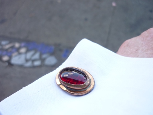
Today’s cufflinks are really quite lovely, being made out of brass with a real red garnet gem in the middle. They’re shaped like semi-globes and have an interesting ornate pattern repeated across their surface. They bear the maker’s mark of Michaud. This is the married couple of Gladys and Arthur Michaud who founded their company in the 1930s, a venture which lasted half a century. Gladys would scour the Paris flea markets for buttons which were then converted into cufflinks and sold to high-end stores on the East Coast of the USA. This pair, which might be unique, is almost certainly made from brass military buttons, with the garnet being employed to cover up a hole. I like the recycling that has gone into this product and while they most likely date from the late 1930s, the buttons look like they might be from the nineteenth century. There’s something especially appropriate about buttons metamorphosing into cufflinks since the French term is boutons de manchette, literally “sleeve buttons”. While I adamantly refuse to wear my heart on my sleeve, my cufflinks show how I manage to button up my lax, emotional self in a triumph of style over substance. And thus attired, I am ready to face the world, bright as a button, it could be said!


